Got Food?
iOS Reskin
Got Food? is an iOS application that helps those who are struggling in the US to locate food resources. This application connects people to food pantries and soup kitchens within their zip code.
Role
UX Researcher
UX Designer
Methods
Stakeholder Interviews, Heuristic Analysis, Competitive Analysis, Usability Testing, User Interviews, Affinity Mapping, Persona, Problem Statement, Design Studio, Wire-framing, Usability Testing, Prototyping, Client Presentation
Team
Megan Barbanel, Isabel Michaelides,
Alexandra Ross
Tools
Figma, Sketch, Principle,
InVision, Adobe Illustrator, Zeplin
Projects Scope
What is the problem space?
Our team was hired to add a food advocacy feature to the existing Got Food? app, within a time frame of two weeks.
Our Process

Research

Synthesis

Design

Present
Who is our target user?
Initially we believed our users to be the food insecure population, from our research findings we quickly realized our main user was the food insecure support networks such as social workers and case workers.
User Research and Persona Development
We contacted professionals who work directly with the food insecure population. We wanted to learn about what is important to our users and if there is interest in an advocacy feature before building one. We conducted 6 interviews with case workers in order to collect information about our users needs, pain points and priorities.
We synthesized our research through affinity mapping, and found that while some of our users showed interest in an advocacy feature they prioritized basic survival when it came to food.


Key Findings:
-
Clients mainly find out about pantries and soup kitchens by word of mouth.
-
Caseworkers look for kitchens/pantries based on proximity, hours of operation, accessibility and amenities.
-
The information provided on apps and online is often inaccurate.


We changed our scope based on these findings. Instead of building a new advocacy feature we prioritized correcting inaccurate information for our users. From these insights, we created our persona.
Persona
Jane is a caseworker who works for a nonprofit organization that helps ensure all people have sufficient access to food. Her client base is diverse - from working families to homeless people to immigrants and the elderly. She wants to be able to help her clients as best as she can by providing them with accurate information about where they can access food.

What we learned
From our research we learned that there is an interest in food advocacy for caseworkers and the food insecure population, however in order for us to focus our design efforts while meeting the needs of our users and stakeholder in the limited time we had, we crafted the following Problem Statement.
Problem Statement
Caseworkers consider factors like proximity, accessibility, hours, and amenities when referring their clients to local food pantries and kitchens but often the information online is not accurate or up to date.
How might we help Jane provide her clients with accurate information about where they can access food?
Before we started designing
We conducted 4 Usability Tests on the existing 'Got Food?' app in order to understand how users interact with it currently. Here's what we found:
2/4 Users had a hard time identifying the hours of operation due to the large block of text listed.
4/4 Users were able to successfully find a pantry but, none of the users utilized or noticed the distance
slider on the home page.

Original Home Page
Original Pantry Info Page
Competitive Feature Analysis
I was interested in what our competitors were up to. In order to best design for our users mental mode and meet their expectations with something familiar I conducted a Competitive Analysis. I discovered the competitors have maps on their search results page, as seen below.

Food Finder
Find Help NY
Byte-to-Bites
From here I saw an opportunity to add a map feature as a visual aid to our search results page.
Heuristic Analysis
To make sure the app meets best practices I took initiative and conducted a Heuristic Evaluation.
What we learned
Using the Abby Method (10 heuristic Information Architect principles) I discovered the existing app functions overall but doesn't meet best practices when it comes to:

Key Takeaways
-
The existing home screen has misleading content.
-
The font size, colors, and backgrounds don't meet accessibility requirements.
-
The interface of the app is unappealing and colors are hard on the eyes.
Design Studio
Once we knew where to improve upon we began designing. The goal was to stay as close to the original design and layout as possible while improving the app to meet best practices.

Low-Fidelity Wireframes
From our Design Studio we combined our designs into low fidelity wireframes which we were able to test, validating our concept before designing digitally. With user feedback from these tests, our concept progressed to mid-fidelity wireframes using Sketch. We designed for the smallest breakpoint, an iPhone 6.


Mid-Fidelity Wireframes
We conducted 5 usability tests with successful results.

New Home Screen
New Options Near You
New Pantry Info Screen
New Feedback Screen
WHAT WE IMPROVED (Heuristics)
Original Home Screen

Findability Issues:
The red button on the home page distracts users from the main functionality of the app, which is to find food.
Findability Issues:
Text on 'Pantry Info' page under 'Hours of Operation' is dense and hard for users to parse through.

New Home Screen
Solution:
Change the red 'Need SNAP Assistance?' button to make it less prominent and focus the attention on the main functionality of the app.
Original Pantry Info Screen

New Pantry Info Screen

Solution:
Separated the text under 'Hours of operation' into distinct groups based on information type.
Accessibility Issues:
Color contrast between the white input fields and the light green background does not meet accessibility standards.
Solution:
Increased color contrast on the home page in order to meet accessibility standards.

Original Home Screen
New Home Screen

Accessibility Issues:
The use of color to differentiate between a Pantry and Kitchen is not an accessible to color blind people.

Original Options Screen
New Options Screen

Solution:
Use icons to differentiate between categories, as people can more easily distinguish change in form rather than color.
Communication
Issues:
There is no indication of the applications function on the home page.

Original Home Screen
New Home Screen

Solution:
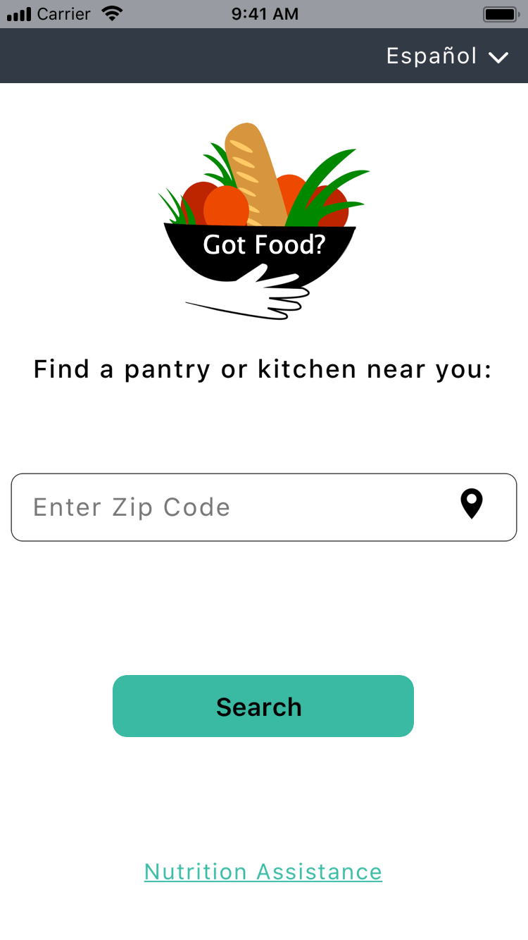
Added a short description the home page indicating it's function. Changed the logo to something that is more indicative of the apps function.
Credibility Issues:
Information provided under the 'Pantry Info' page is not always accurate, which could cause users to mistrust the application. It is not clear what the 'Reviews' button is for.
New Pantry Info Screen
Original Pantry Info Screen
Solution:
A 'Report Correct Info' button clearly states its function.


Hi-Fidelity
Before we designed hi-fidelity we researched color palettes. We were looking for friendly and uplifting colors that would delight our users.
I took initiative and researched a new logo that would be better associated with the Got Food? app. I did this by taking the name out of the original logo and leaving only the image (as seen below on the left) and then asked 5 users what they believed this brand did. 4/5 users thought the Got Food? logo was part of a gifting service. When I conducted the same test with the new logo (as seen on the right below) 5/5 users successfully thought it had to do with food.


Original Logo
New Logo
What We Improved (Heuristics)
Original Home Screen
Findability Issues:
The red button on the home page distracts users from the main functionality of the app, which is to find food.
Findability Issues:
Text on 'Pantry Info' page under 'Hours of Operation' is dense and hard for users to parse through.
New Home Screen
Solution:
Change the red 'Need SNAP Assistance?' button to make it less prominent and focus the attention on the main functionality of the app.
Original Pantry Info Screen
New Pantry Info Screen
Solution:
Separated the text under 'Hours of operation' into distinct groups based on information type.
Accessibility Issues:
Color contrast between the white input fields and the light green background does not meet accessibility standards.
Solution:
Increased color contrast on the home page in order to meet accessibility standards.
Original Home Screen
New Home Screen
Accessibility Issues:
The use of color to differentiate between a Pantry and Kitchen is not an accessible to color blind people.
Solution:
Use icons to differentiate between
categories, as people can more easily distinguish change in form rather than color.
Original Options Screen
New Options Screen
Communication:
There is no indication of the applications function on the home page.
Original Home Screen
New Home Screen
Solution:
Added a short description the home page indicating it's function. Changed the logo to something that is more indicative of the apps function.
Credibility Issues:
Information provided under the 'Pantry Info' page is not always accurate, which could cause users to mistrust the application. It is not clear what the 'Reviews' button is for.
New Pantry Info Screen
Original Pantry Info Screen
Solution:
A 'Report Correct Info' button clearly states its function.
Hi-Fidelity
Before we designed hi-fidelity we researched color palettes. We were looking for friendly and uplifting colors that would delight our users.
I took initiative and researched a new logo that would be better associated with the Got Food? app. I did this by taking the name out of the original logo and leaving only the image (as seen below on the left) and then asked 5 users what they believed this brand did. 4/5 users thought the Got Food? logo was part of a gifting service. When I conducted the same test with the new logo (as seen on the right below) 5/5 users successfully thought it had to do with food.
Original Logo
New Logo

Home Screen
Options Near You
Pantry Info Screen
Report Info Screen
Affirmation Screen

Next Steps, if we had more time.
-
Usability Testing for the updated hi-fidelity prototype in order to iterate on the design to improve usability.
-
Building out the app pages to include information with the added USDA database, WIC, SNAP, EBT, etc. as users previously mentioned wanting access to.
-
Conduct a design studio for the advocacy feature as users mentioned having an interest in advocating for food bills.